ShopDreamUp AI ArtDreamUp
Deviation Actions


Description
Pencils: 
Original Sketch: [link]
Original Colors: [link]
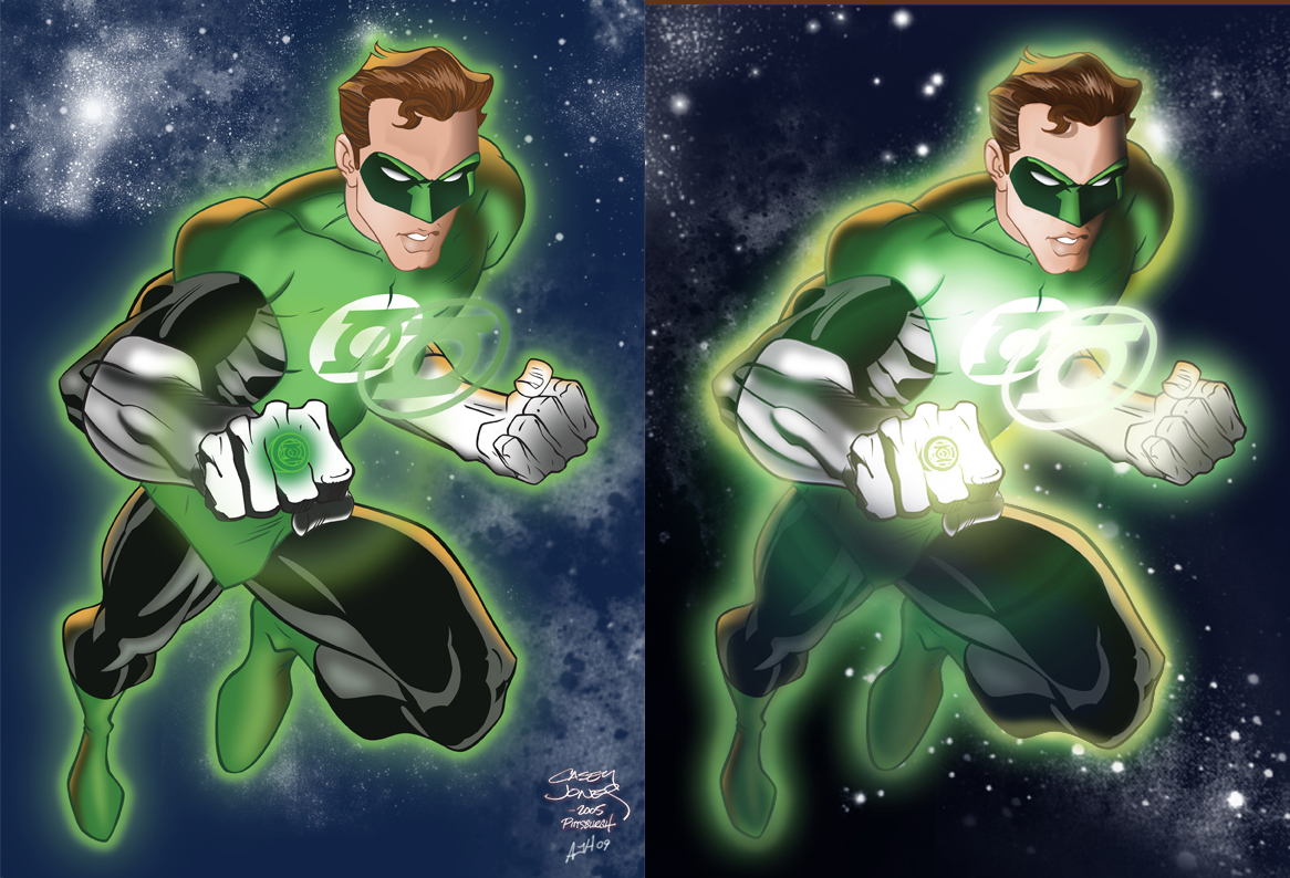
So I asked to do a review of my original submission and she gave me some great instructions, even providing a nice example for reference. She nailed a lot of issues I was aware of but technically didn't know how to produce it all I needed was a push (and that reference really helped). She also pointed something out in regards to the legs and creating distance with coloring down the legs a bit, something I'd seen done by other folks but completely completely overlooked for my piece.
That all being said, her suggestions, instructions, kindness and support really helped to make the newer version pop like I wanted it to.
I'll be posting a single of the new version as well, just cuz I can (Smile)")
Original Sketch: [link]
Original Colors: [link]
So I asked
to do a review of my original submission and she gave me some great instructions, even providing a nice example for reference. She nailed a lot of issues I was aware of but technically didn't know how to produce it all I needed was a push (and that reference really helped). She also pointed something out in regards to the legs and creating distance with coloring down the legs a bit, something I'd seen done by other folks but completely completely overlooked for my piece.That all being said, her suggestions, instructions, kindness and support really helped to make the newer version pop like I wanted it to.
I'll be posting a single of the new version as well, just cuz I can
Image size
1166x794px 595.87 KB
© 2009 - 2024 AndrewJHarmon
Comments4
Join the community to add your comment. Already a deviant? Log In
Very cool work, and as soon as Im done replying I will watch you. But anyway, something about the version on the left just really bothers me.
In looking at the 'glow' from the ring, I fully see your light source and function there of. However, the glowing emblem on his chest is my major issue. I can see it gives off quite a bit of light as noted on his inner left forearm, very bright. However, as I view the image I notice his face and emblem are facing the same direction, so the actual shadow on his face is misplaced. Half his face is in shadow, which would be the case from the angle of the light coming from the ring, but the light coming from the chest emblem seems to be nonexistent except on his forearm.
Maybe being a photographer and a hack artist myself the principles of light are more evident to me. It just throws me off because the emblem is nearly right in front of his face and his face is covered in half shadow...doesn't look right to me.
The recolour certainly does pop more because of the addition of lights and darks to the piece. Though that shadow just gets me L()L. Well done overall.